Strive Tech Mobile App
Teams iPadOS Strive Tech Load Management App and Consumer iOS Strive Tech Training App
UI Experience Loading…
Bringing my design experience to Strive Tech offered me a unique opportunity. In addition to contributing as an industrial designer, I also had the opportunity to own UX and UI for a new-to-world app. Working in this discipline for the first time while simultaneously designing the hardware and packaging presented a fun challenge. For this project I accomplished the below:
Managed a consultant and an intern to build out our design library and accommodate work flows
Shipped a Teams app
Shipped a Consumer app (different use case and updated design)
Shipped new features
Updated components
Let’s start off with an overview. What is Strive Tech?
The Strive Tech experience is a wearable tech that measures the user’s muscle activity and offers data, analysis, and insights to aid in achieving peak performance. The wearable is a pair of sensor lined compression shorts with a bluetooth enabled Pod that connects to the user’s iOS device. The shorts capture muscle activity from the athlete’s Quads (quadriceps), Hams (hamstrings), and Glutes (gluteus maximus), and offers summary and detailed views of muscle exertion, muscle distribution (exertion across 3 muscle groups), and muscle symmetry (left leg VS right leg exertion across 3 muscle groups). The accelerometer in the Pod also displays movement intensity which gives the user additional context to understand the workout journey and make meaning of the muscle data (what was I doing at this point in my workout?).
Strive Tech offers it’s technology to collegiate and professional athletes through the Teams App experience, and to consumers through the Consumer App experience. The consumer app experience centers on a familiar framework; the user creates their profile, adds their hardware to their profile and facilitates their own sessions and interacts with their own data.
A More Detailed Look At The Consumer App…
Onboarding: Profile Creation, and Connect Pod
Home Navigation, New Session Dialog, and Live Session
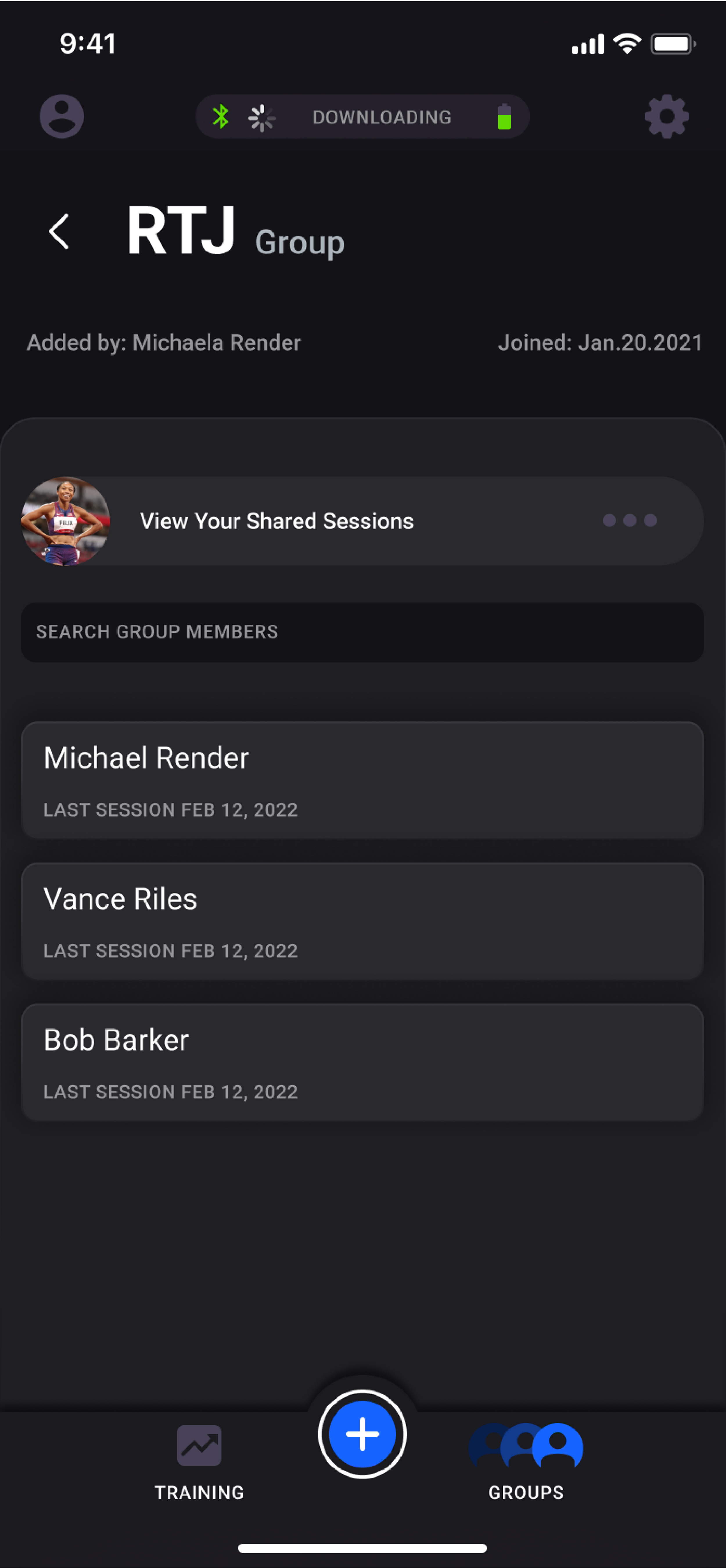
Groups: Confirm or Deny Admission to Group, View Group Member Session and Movement Eval Performance
Clickable Protos
In the iOS prototype example shown here, the user is able to log in, create a user profile, add Strive hardware to their profile, start new activity sessions, analyze existing session data and join or create groups to share data with coaches, trainers, etc.
This prototype is a look at the consumer app and it’s respective workflows.
In collegiate and professional use cases, the Strength and Conditioning Coach is the Strive user, and the Athlete(s) wears the hardware. In this one-to-many use case, the strength and conditioning coach’s onboarding is such that they add Pods to their Org via Bluetooth, then create athlete profiles with pods assigned. Now the strength and conditioning coach can facilitate workouts with their roster by adding relevant athletes to a “session” and starting that session. In the below example, you can follow the onboarding flow to add nearby pods and create an athlete profile with pod assigned.
Navigating back to the home page you can see that the user has completed setting up their org, as they have a full roster of athletes, each with their own Strive Pod assigned. Now, let’s start a new session!
During a live session, the strength and conditioning coach can toggle the different summary and detail views to monitor activity across their athletes’ various muscle groups.
Quantification and analysis of muscle activity aids the strength and conditioning coach in managing work load and keeping them ready to perform at their peak. Let’s look at some of the work flows that aid the user in their goal of understanding their athlete’s muscle performance. The first major workflow is Tagging. Tagging allows the user to specify the movement associated with a particular section of muscle data. The user can “tag” their data during a live session or while reviewing or editing a previous session.
Now for a closer look at some of the components’ visual design.
Data visualization in the Strive app presents both a cumulative performance, as well as muscle performance over time. Below are the visualizations for cumulative performance, and data over time.
One of my favorite steps in the design process is arriving at the stage when the object can be interacted with, as it reveals opportunities for fine tuning that can really elevate the object. One of the first revisions I made to our app was to correct the visual balance of the graphs. The original design of the graphs weren’t as immersive as they could be, and I knew it had everything to do with the left/right balance of the graphs visual design. The graphs really want to be a center-aligned full-width experience, but visually the Y-Axis presents more like white-space and makes the graphs appear to be right-aligned with uneven L/R margins.
By moving the y axis of the graph in-board I could stretch the graphs’ x axis across more of the screen which restores the visual balance of the graphs. Lastly, I applied a blurred layer behind the numbers to reestablish their contrast against the data that now is apart of their background.


